Compare carrier performancewith the context attached
Bring delivered-shipment volume, label-to-delivery time, first-scan time, carrier transit, cost, destination, and zone into one filtered report. Compare the carrier and service results observed in the selected period without losing the sample size behind each view.
Request a demo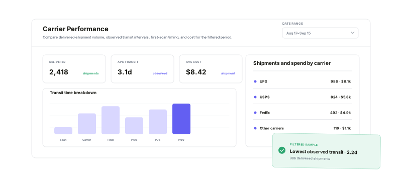
Use the same filtered response to move from overall timing and spend to service, geographic, and route-level comparisons.
Three time intervals
Separate creation-to-delivery, first-scan, and carrier-transit time.
Carrier + service rows
Sort volume, time, and cost measures for every observed combination.
State + zone context
Compare destination states and carrier-zone cells inside the same scope.
Visible sample size
Keep shipment count beside observed transit and cost results.
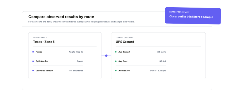
Compare what each routeactually recorded
Group the filtered delivered sample by state and zone, then compare the carrier/service combination with the lowest observed average under speed or cost with every recorded alternative. The period, transit, cost, and shipment sample remain visible so the result stays grounded in the selected history.
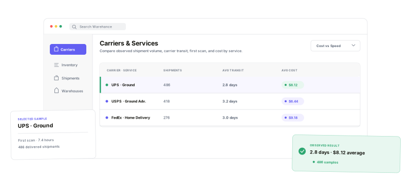
Compare the servicebehind each carrier
Sort carrier and service combinations by shipment count, total transit, carrier transit, first scan, average cost, or total cost. Use the cost-versus-speed scatter to keep average time, average cost, and sample volume visible together—not as a promise about the next shipment, but as a comparison of what the filtered sample recorded.
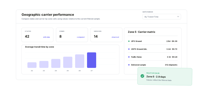
Read the same resultsby destination and zone
Switch the US state map among volume, average transit, and average cost. Then use the zone matrix to compare carriers, expand their services, and inspect one populated zone cell. Every color remains relative to the current filtered data rather than a universal grade.
Carrier Performance questions
Put carrier, service, destination, and sample size in one view
Start running your warehouse operations with Warehance today and experience complete freedom to grow your business without compromise.
